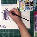
While this is a standalone episode, if you want to see the start of our discussion on using shading to create realistic drawings, watch last week’s livestream replay here.
Hey, friends!
Thank you
, , , , and many others for tuning into the livestream! I look forward to our time together on Wednesdays very much.Recap
Today we simplified shadow and light into two guidelines:
Cool and dark colors equal shadows, while bright and warm colors equal light;
NEVER allow your lightest dark to become the same color or lighter than your darkest light.

Of course, this has more nuance (see the caption above) and thus not a “rule,” but for the purposes of keeping things simple for nature journaling if you keep these two points in mind, it will help you create a more realistic, 3D look to your visual journaling.
The materials I used today
Watercolors
Quinacridone Gold (a warm, leans orange, yellow)
Quinacridone Rose (a cool, bright red)
French Ultramarine (a warm, red leaning blue)
Moonglow (a dark neutral that is as incredible in mixes as it is on its own — it’s a mix of Viridian, Anthraquinoid Red1, and Ultramarine)
Paper
Strathmore 500 Mixed Media paper — this was a sheet, but it’s the same paper in my nature journals
Brushes
Water brushes - Pentel Aquash brushes
Golden Synthetic Spotter #5 from Rosemary & Co
Pens
Micron 005 in Black
Pentel brush pen in Black
I also mentioned Jane Blundell’s discussion of triads, which you can find here. While I use a full mixing palette of carefully curated colors in my studio work, I love using triads in the field. The one above is my tried and true, but I will substitute other colors for fun.
Until next week!
xoSusannah
P.S. Keep scrolling if you’d like to see what’s on my easel this week.
Every Wednesday at 1:30pm Eastern US time (Time Converter), we marvel in our nature journals together — draw along with me or just watch, ask questions, etc. Livestreams are hosted on Notes for everyone, and recorded/archived for paid subscribers.
Download the app to join me live:
Listen to this episode with a 7-day free trial
Subscribe to Cricklewood Nature Journal to listen to this post and get 7 days of free access to the full post archives.


